Layout
Layout
Name two CSS properties that we learned that help define the layout of an HTML document. →
displayposition
Let's Talk About Display
Every element on a webpage is essentially treated as a box.
The display property determines how that box is rendered. What are some possible values of the display property? →
inlineinline-blockblocknone
We'll take a peek at some other interesting ones later. But first. →
Block
An element that is display:block:
- starts a new line
- …and stretches out as far horizontally as possible (full width)
- you can specify a block-level element's width and height!
- some elements that are commonly displayed as block:
div,p,h1, etc.
Inline
An element that is display:inline
- stays in line with its surrounding elements
- think of a single word in a paragraph.
- does not have a
widthorheightthat can be specified - however (as we saw in previous slides) it can have a border, background… and even a margin and padding (though only horizontal margin and padding)
None
If an element is display:none:
- the element is not displayed and has no effect on layout
- all elements nested within it are also not displayed
- the document is rendered as if the element did not exist
Inline-Block
If an element is display:inline-block:
- it behaves similarly to inline elements in that it will stay inline (no new line)
- however, you can give it a height and a width
Ok, a Quick Summary
Two consecutive inline elements will display ______________ each other. →
adjacent to
Two consecutive block-level elements will display ______________ each other. →
stacked on
Two consecutive inline-block elements will display ______________ each other. →
adjacent to
Some Weird Ones
There are many other possible values for the display property. Let's take a look at a weird one: →
Table related values:
tabletable-celltable-row
Table-* (Yikes!)
So… table, table-cell and table-row are all display properties that apply to (as their names imply) tables, cells and rows.
However, you can make any element behave like a table; just add the appropriate display (but whyyyyy?) →
Maybe there's an element that describes your content more accurately than td?
Visibility
Oh yeah… what's the difference between visibility:hidden vs display:none. →
display:nonetakes the element out of the document completely- surrounding elements are arranged as if element never existed!
- …however,
visibility:hiddenkeeps the element in the document, but does not show it- surrounding elements are arranged as if the element were still in place
Box Model
An Element's Width and Height
Now that we know some elements have a width and height, while some don't… we should probably figure out what width and height actually mean.
Is the width and height all there is to figuring out the dimensions of an element? What else has to be taken into account? →
bordermarginpadding
How are they all related? Let's see on the next few slides. →
box-sizing
box-sizing is the CSS property that determines the box-model used to calculate the width and height of an element.
Two values that we'll look at are:
content-box(the default)border-box
content-box
content-box is the default value for box-sizing. This box-model:
widthandheightare calculated by the content only- it does not include
padding,border, ormargin
content-box Diagram
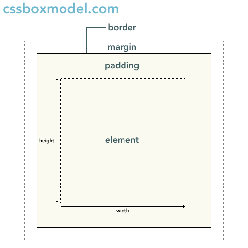
- the border is between the margin and padding
- padding adds space between the actual content and its border
content-box Issue
- clearly, in the default box model, border, padding (and margin) are not included in width calculations
- why is this an issue? →
- the following are both 150px wide (!?) →
border-box
If the value of the border-box property is set to border-box,
widthandheightincludepaddingandborder- it, however, does not include
margin
Not Quite Fully Supported
box-sizing: border-box is a bit new:
- you'll need to use browser/vendor prefixes to get this working in all browsers
- using prefixes is a way for browsers to support new and/or not-yet-finalized features
- (some prefixes include:
-moz-for firefox and-webkit-for Chrome and Safari
* {
	-webkit-box-sizing: border-box;
	-moz-box-sizing: border-box;
	box-sizing: border-box;
}
Positioning
The position property specifies what rules to use for positioning an element in the document:
What are some possible values? (we know two of them at least) →
staticrelativeabsolutefixedsticky
Static / Not Positioned
The default positioning of an element is static, or not positioned.:
- it is laid out in its current position in the flow (no special positioning)
top,bottom,left,right, andz-index(depth) properties do not apply to an element that is not positioned
Relative
An element with position:relative can be positioned relative to where it would normally be in the document:
- behaves the same as static… that is, unless…
- you supply
top,bottom,left,right, orz-indexproperties, the element will be moved accordingly - other elements flow as if the positioned element were in its normal place!
A Note About top, bottom, left and right
For relatively positioned elements:
- top specifies how far an element is moved below its normal position
- bottom specifies how far an element is moved above its normal position
- left specifies the offset that the element is moved left from its normal position
- right specifies the offset that the element is moved right from its normal position
By default, these are all set to auto. They can be set to a length or percentage of the containing element.
Depth
There's also a property called z-index. What does z-index do? →
- specifies the depth of an element
- when elements overlap, z-index determines which element covers the other element
- an element with a larger z-index covers an element with a lower z-index
Fixed
An element with position:fixed:
- is positioned outside of the normal flow (no space is left where the element would normally be)
- it's positioned relative to the screen's viewport
- it stays in the same place even when it's scrolled
- the top, right, bottom, and left properties are used
- width will shrink to fit content unless width explicitly specified
Absolute
An element with position:absolute:
- similar to fixed except relative to nearest positioned ancestor (or body if no positioned ancestor)
- also positioned outside of the normal flow (no space is left where the element would normally be)
- the top, right, bottom, and left properties are used
- width of element will shrink to fit content unless width specified
How About a Practical Example
Let's talk through what's involved in creating this layout. →
- maybe check out the actual page itself… then the html
- with an eye towards the header, nav and sidebar
About the Header
How did we make the header stay in place, cover every element and stretch across? →
header {
	position: fixed;
	top: 0;
	left: 0;
	height: 50px;
	background-color: white;
	width: 100%;
	border:3px solid #090;
	z-index: 1;
}
- note the z-index to make sure it's above the other elements.
- also the width is set to 100% (since the default width of a fixed element shrinks to wrap content)
And That Nav?
How do you think the nav is positioned so that it's on the top right of the header? →
nav {
	position: absolute;
	right: 0px;
	top: 0px;
}
It's relative to its ancestor, the header… so we can use absolute.
How About the Sidebar?
Finally… how is the sidebar right aligned using the position property? →
.sidebar {
	position: absolute;
	right: 0px;
	width: 150px;
	border: 3px solid #800;
}
What will happen if we make position absolute? →
It'll go under the header and above the div with class="hero".
Sizing
Sizing
You might have noticed that there are multiple units of measurement that we could use for properties such as width or margin.
What are the possible units? →
There are many! (Here are a few that we'll go over).
- relative
emrem
- absolute
px
em
An em is a dynamic sizing unit relative to font-size:
- an
emis equal to the size of the font that applies to the parent of the element - for example,
2emis twice the size of the parent's font-size - (usually, the default browser styles for font-size end up being about 16px)
rem
rem represents the font-size of the root (<html>element).
2remis twice the size of the root element's font-size- behaves similarly to ems, but doesn't stack for nested elements
Relative Units
Both rem and em are relative measurements.
Why might using relative measurements be useful? →
- easy to change sizes throughout
- just change the root element / parent element, and everything else changes in proportion
- particularly useful for media queries / responsive design
Let's try upping the font size … when we have them initially set to pixels. →
When to Use px/rem/em
It may be confusing determining which one to use. It depends on what you're trying to accomplish.
- generally, use relative sizes so that changing is easy
- use pixels when you want elements that stay a consistent size (usually things like setting max/min width, margins, borders or padding, rather than text)
Some articles…
Selectors
Selectors
What's a selector again? →
A selector is the part of a CSS rule that determines what element or elements the style declarations apply to:
In the following code, p is the selector:
p {
	margin: 10px;
}
Possible Selectors
This one may be a bit difficult to answer… but what are the possible values for selectors? →
Some that you might be familiar with are:
- by tag name… simply reference the name of the tag, and the style will be applied to all of those tags
- by
classname - by
id
Class and ID
class and id are attributes that you can place in your elements. What's the difference between the two again? →
- multiple elements in a document can have the same value for
class - but values for ids should be unique within a document - only one element can have an id with a specific value
- an element may have both a class and id attribute.
Using Class and ID Selectors
- to select elements with a specific class, prefix the class name with a period
- to target an element with a specific id, prefix the id name with a hash sign (pound or number symbol)
This has a selector, .highlight that gives an element a yellow background, and a couple of ids that specify borders.
Element Name with Class/ID
You can use both a tag name and class or id as your selector for increased specificity:
- for an id: tagname#idvalue
- for a class: tagname.classvalue
In the previous example, how could be modify the markup so that divs that are highlighted have a green background, while paragraphs that are highlighted stay with a yellow background? →
More Attributes
You're not limited to class and id for attributes:
- you can actually specify any attribute and attribute value that you want!
- use brackets, and within the brackets, either an
attributeorattribute_name='value' - examples:
[type='button']- selects only elements with a type attribute that's equal to "button"[data-pinned]- selects elements that just have an attribute called data-pinned (no associated value is necessary)input[type='button']- you can also prefix to specify tag with attribute!
Using Arbitrary Attributes
A couple of examples using attributes other than class or id:
Multiple Selectors
In some of the previous examples, you have noticed that there were several selectors on one line, separated by commas.
Selector grouping allows multiple selectors to be defined for a single rule:
Relationships
Relationships between elements can also be expressed with selectors! (from the CSS selectors article on MDN):
A E… Any E element that is a descendant of an A element (that is: a child, or a child of a child, etc.)A > E… Any E element that is a (direct) child of an A elementE:first-child… Any E element that is the first child of its parentB + E… Any E element that is the next sibling of a B element (that is: the next child of the same parent)
Some Examples
This demonstrates the selection of elements based on their relationships:
Pseudo-classes
pseudo-classes are keywords that you add to a selector to specify the state of the element.
For example, what are some states that you think an anchor element (a link) could have? →
- hovered over
- non-visited
- visited
There are pseudo-classes for each of these states! →
Pseudo Classes on Links
:hover- mouse hovers over (any element, not just links):link- non visited link:visited- visited link
Before/After
Before and after actually lets you insert content before or after an element!
::before::after- they don't actually appear in the dom!
Some values that the content can be are
- a string
- an image
Before and After Example
Two examples, one with text… and the other with an image.
nth-child
:nth-child(…) matches an element that is the nth child of its parent. Children are numbered starting from 1. The argument for nth-child can be:
- a single integer -
nth-child(5)- selects the 5th child - a keyword, even or odd -
nth-child(even)- selects every even numbered child - an expression in the form of an + b -
nth-child(2n + 3)- selects every 2nd child starting from the 3rd- n represents the sequence of integers starting from 0, and incrementing by 1
- evaluating the expression gives you the number of each child selected (in the case above, 3, 5, 7, etc.)
nth-child Examples
Try out nth-child using the nth-child tester from css-tricks…
Or, check out the fiddle:
On Style
Stylesheets can get unwieldy pretty quickly. Some ways to keep things readable an organized are:
- use grouped /multiple selectors
- one property value per line, indented
- comments (
/\* \*/) when appropriate - group like rules together or use some other organization scheme
- use container elements if you need to hook into style exceptions
- use a framework and/or use a css precompiler!
Some others in:
Of Course, Some JavaScript
As we mentioned in the previous class, you can use an element's style property to modify its actual style properties.
An element's style property has properties as well… and these are the names of CSS properties.
var myelement = document.getElementById('myelement');
myelement.style.color = '#a20';
If the style property is hyphenated, use camel case.
// background-color becomes backgroundColor
myelement.style.backgroundColor = '#797';
classList
You can also use the classList property of an element to add or remove classes. It has methods of the same name.
For the following element:
<p class="foo bar">first one</p>
You can use this code to manipulate its classes.
myelement.classList.add('baz');
myelement.classList.remove('foo');
Specificity
What color will the background of the list item be, and how did you come to that conclusion? →
Specificity Calculation
The CSS 3specs provides an algorithm for determining specificity - which selector has precedence over another:
- count the number of ID selectors in the selector (= a)
- count the number of class selectors, attributes selectors, and pseudo-classes in the selector (= b)
- count the number of type selectors (this includes regular elements) and pseudo-elements in the selector (= c)
- ignore the universal selector and the negation pseudo-selector (but count selectors within it)
- concatenate the three numbers a-b-c (in a number system with a large base)
- larger specificity wins
Specificity Examples
Whew… um, so how did that actually work? Let's check out some examples:
- this specificity calculator also includes inline styles as part of its calculation
- the CSS3 specs also have some examples
Generally, Switch Classes, Not Styles
Try to avoid access style… and instead toggle classes
- have your styles pre-built in your css
- use classList to toggle classes than
- helps prevent mixing logic and presentation from being too intertwined
- for example, matching colors in your css and your js
- allows you to change styles without modifying code